Political Manifold Theory - Under construction!
Disclaimer: This article is very much tongue-in-cheek, there should be no attempt to interpret it otherwise.
Classical theory: the Political Compass
Introduction to The Political Compass
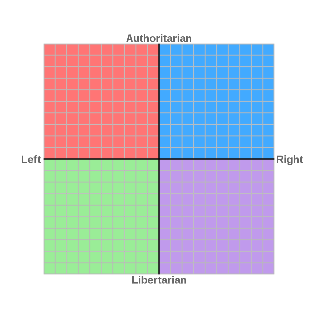
The Political Compass is a way of visualising the political alignments of organisations or individuals (henceforth use entity to refer to either), via a mapping depending on two attributes: the economic views of the entity, plotted on an economic 'Left-Right' axis, and the social views, plotted on a social 'Libertarian-Authoritarian' axis. See below:
This constitutes a mapping {entities} → R2. This mapping is assigned by responses to a set of 62 propositions (not in the sense of mathematics). The Compass is now 20 years old, and was produced to generalise the 1-dimensional Left-Right prescription of politics. It is probably the most high profile of several multi-axis models, with others having for example a 'Radical-Conservative' axis, or the Nolan Chart, which replaces the 'Left-Right' axis with a 'Liberal-Conservative' axis, which you might think is the same thing, in which case you're probably American.
On the economic axis, note that Left and Right are given a more concrete and specific meaning than is used in general discourse, so we will just refer to this axis as the economic one and not 'left-right'. The positive direction points in the direction of market freedom, so we have a totally free market in the positive extreme, and a totally regulated market in the negative extreme, with the market totally controlled (in an idealised sense) by a regulator (e.g. a government).
On the social axis, the positive direction points in the authoritarian direction. Again authoritarian and libertarian are being used more concretely than in normal usage. The positive direction points in the direction of social freedom being controlled by an authority (e.g. a king or a military regime) while the negative direction points in the direction of no authority, and social freedoms are left to individuals.
The makers of the Political Compass claim that these two axes are independent. We'll take this to mean that there is an inner product on the Compass, under which the economic and social axes are orthogonal. There is a freedom to choose the positive directions. For the standard Compass, the positive directions are chosen so that the expected relation, that as you go in the positive economic direction or 'go more right', then you go in the positive social direction, i.e. 'go more authoritarian', coincides with the 'y=x' line on the Compass.
Advantages
The Political Compass is an intuitive diagram for showing the approximate political views of entities, and is a useful dimensional reduction of what is a horribly ill-defined and high dimensional space of entities. This reduction is nice as humans are good at dealing with 2d information. We can only just about deal with 3d information via 2d slices or perspective tricks. But the Compass can only be a submanifold of our encompassing Political Manifold. You might think that we are needlessly complicating a simple, informative diagram, and that's because we are.
A more detailed look
We don't get much use out of just considering the Compass abstractly. The usefulness comes from actually applying this mapping to, for example, the parties running in an election. We'll see that it makes more sense to consider the Political Compass of a set of entities, say parties running for an election, than the Political Compass alone. Let's look at the Compass applied to the 2020 election in the US.
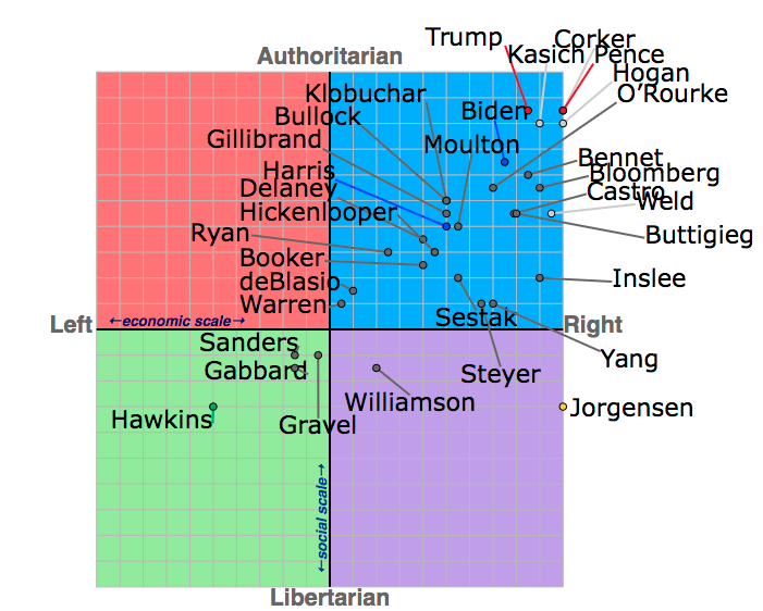
This compass has economic units of Econ(deBlasio), here identifying the person Bill de Blasio with their point on R2 under the Compass map, and Econ() being the projection onto the economic axis. It has social units of Soc(Warren) or alternatively units of negative Bernie. We get our first suggestion that a mapping to R2 is in fact too strong: our units are defined in terms of points on the Compass. The 'data' of this Compass is captured by relative separation, and hence preserved under rescaling (by a positive number). In fact, we may rescale each axis independently. There is no canonical choice of scale for either axis, so we work in the negative Bernie gauge on the social axis, which is useful in that it makes the social differences between candidates manifest to the naked eye while allowing the diagram to be displayed on a screen.
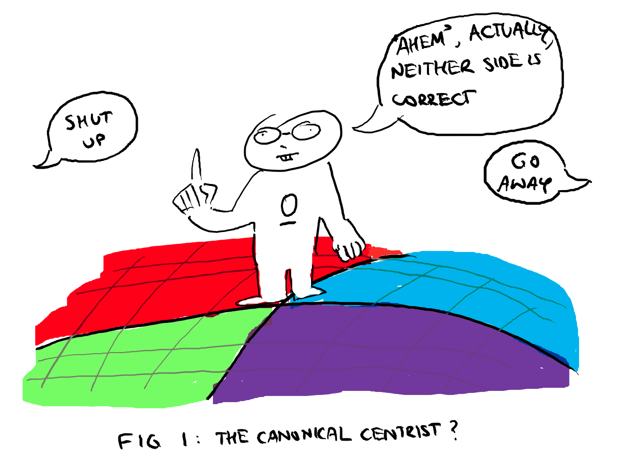
There are bigger problems. Just as we don't have a canonical scale, there is no canonical choice of origin. Most Americans would almost certainly have the zero on the economic axis placed further to the right. Below, an imagined version of a canonical centrist.
So in full generality we must throw away the origin, giving a 2d real affine space. Given the Political Compass of a set of entities, we may further say that two compasses are equivalent if they are invariant under positive rescalings about any point where rescalings only need preserve that the inner product is diagonal, but otherwise allows independent rescalings of the Ec and Soc axes.
Exercise: consider a Political Compass of n entities. Show that the ratio of distances between two different pairs of points in either the Ec or Soc directions are preserved under the equivalence relation. What are the equivalence classes? I.e. find a good description.
But let's revisit this assumption that our metric is diagonal with respect to Ec and Soc axes. It's certainly not true that they are independent in the sense of probability. On the majority of these compasses produced for different elections, most entities lie along the 'y=x' line. There isn't a perfect correlation though: under Mao there was both a heavily regulated market and social freedoms were strongly policed by an authority. To say that market freedom and social freedom are independent would be incorrect though, since an example of a social freedom is the freedom to enter the market as a buyer or seller.
Takefunctions
There is also a problem of what the points on the Compass should be. The examples given on the Political Compass site are mainly individuals or political parties, defined sharply at a single point on the Compass. But it is unlikely that all views held by an individual will align exactly with that position on the Compass. Rather, they should be represented by a 'cloud' or distribution over the Compass, which captures a superposition of their views. I will call this a takefunction. This takefunction is even more diffuse when describing a party, as it is then a superposition of the different members of the party. But then, there are sharply defined objects on the Compass: the takes themselves. These are eigentakes, and on both the economic and social axes we have a continuum of eigentakes.
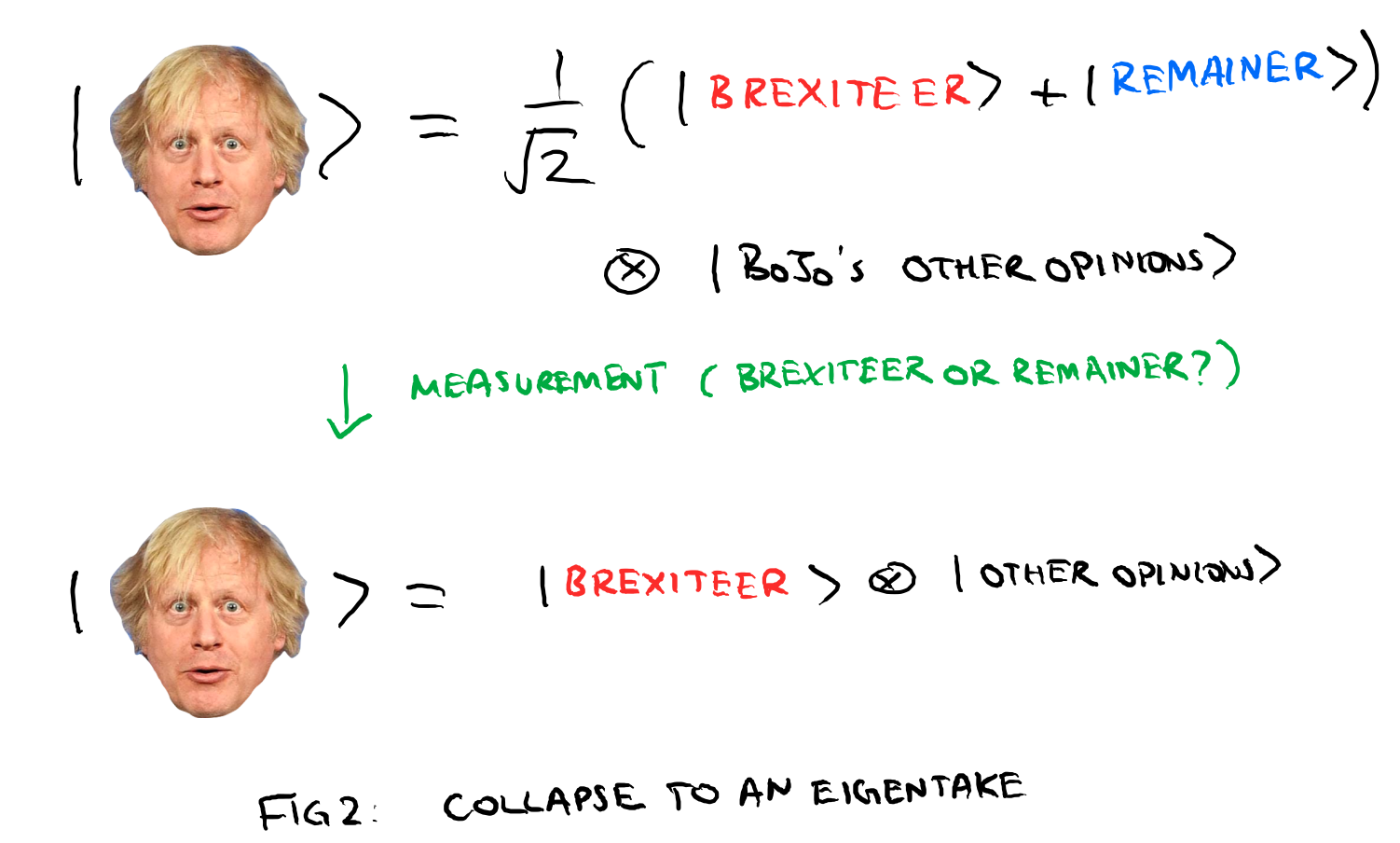
We call the space of these takefunctions our marketspace of ideas. We can steal ideas from the formalism of quantum mechanics to now explain the phenomenon of cognitive dissonance, which of course is not a quantum phenomenon. As people, we are all familiar with the ability to hold two mutually contradictory ideas simultaneously, for example knowing that you need to work to meet some deadline but procrastinating instead. But in QM there is the similar notion when a particle is in a superposition of spin up and spin down states. Cognitive dissonance is a superposition of takes. A famous example is Boris Johnson's Brexit article. He wrote two articles, one in favour of Brexit, the other against. When he published the article, his Brexit take was measured, and collapsed to the Brexiteer eigentake.
Going from the classical to the takefunction forms, we now have two spaces to consider: an underlying political manifold, and then an infinite dimensional marketspace of functions taking values on the political manifold. In the classical theory, entities were identified with points on the manifold, and so the space of entities is the manifold itself. In the takefunction formalism, entities are promoted to elements of the discourse space.
Next, to see why we need to generalise from a flat space to a manifold, much like how we need to go to extremes to find situations in which general relativity is needed for an accurate description, we need to go to an extreme environment to see the need for a more general theory.
If you are an active Twitter user, firstly, my condolences. But you will be familiar with a certain type of interaction, in which a tweet gets replies which interpret the tweet in the least generous way possible, in ways that the original poster never cognised. This is especially dangerous when one tweets opinions, a practice that should be avoided at all costs, but jokes are not immune to this sort of attack. This cultivates a pathological defensiveness endemic to twitter, in which before voicing any thoughts, the user must explore all ways that the pending message could be interpreted and prepare counters.
This is more endemic to Twitter than other platforms because of its algorithms. First of all it is a platform for sharing views rather than say photos like Instagram. Facebook can be used for sharing views but importantly its algorithm means you generally see content that you initiate engagement with. You might have to see a problematic uncle's post from time to time, but generally you see content that you have chosen to see, from people that you know or groups that you follow, and hence you have some commonality with the content you see: if you know someone, chances are you know them in real life, so at least you have some shared experience. At the very least, geographically you have both been in the same place, and by virtue of that there will be something you can both complain about.
On Twitter, you have a small degree of control over what you see, but the algorithm determining most people's feed answers to one thing: engagement. To spark engagement, you want to cause strong emotions, e.g. laughter, anger, etc. Geography and social groups are not factored, so the tweets that get the most engagement will be seen by people from vastly different backgrounds and with few shared experiences, and hence will likely interpret the tweet in vastly different ways. But there are some statements which will be interpreted in the same way by most if not all people. We can use coordinates as a heuristic: there are some objects which remain 'the same' under a change of coordinates, and some objects which transform under certain rules under a change of coordinates, but we want this transformation to occurs in such a way that there is some more abstract object, which captures the equivalence class of the object under transformations.
So in this setting, coordinates are interpretations by different people, or viewpoints, not so different to how in special relativity when we talk about observers, we associate to the observer a frame, which is a choice of coordinates. (Note this does not translate to GR, where we take observers to be timelike curves). A take which is viewpoint independent for example might be "New York exists.". I am assuming here a degree of charitability from the reader that viewpoints are being taken from people who know what New York is. A viewpoint dependent take would be something like "New York is a nice place to live".
Viewpoint independent takes could be seen as something approaching 'objective', while 'viewpoint dependent takes' are 'subjective'. But care is needed, and there will be no attempt here to say that viewpoint independent takes are 'objective' or 'true'. It is worth defining viewpoint independence of a take as being dependent on the set of viewpoints, e.g. "New York exists" is viewpoint independent with respect to adult U.S. citizens (which could be a spurious statement. I'm certain "Estonia exists" would not be viewpoint independent). The collection of viewpoints is analogous to an atlas, and we call it a discourse.